




In an era dominated by LinkedIn connections, virtual coffees, and digital portfolios, a humble question still echoes across search engines thousands of times a day: “What is the best business card maker, and how do I use it to create something that doesn’t look cheap?”
Despite living in a highly digitized world, the physical exchange of a business card remains one of the most powerful, tactile moments of professional networking. It is your offline handshake, a physical anchor to a digital interaction.
But here is the catch: we have all been handed cards that felt like flimsy printer paper, featured illegible fonts, or looked like a generic template from 2004.
This comprehensive guide is designed to solve that exact problem. We will explore the psychology of why business cards still matter, evaluate the best business card makers on the market today, and walk you through a step-by-step blueprint to design a card that commands respect and drives action.
1. The Key Question: “Do I Need a Professional Designer, or Can I Do This Myself?”
When people search for a business card maker, they are usually trying to solve a specific, frustrating puzzle:
How do I design a stunning, high-quality business card that accurately represents my brand, without spending hundreds of dollars on a graphic designer or wasting hours struggling with complex software?
The core dilemma boils down to a conflict between cost, time, and credibility:
The Credibility Gap: You want a card that feels premium. If your card looks unprofessional, potential clients might assume your services are unprofessional too.
The Complexity Hurdle: Professional design software like Adobe Illustrator has a steep learning curve. You don’t have three weeks to learn vector mapping just to print a $20 stack of cards.
The Cost Constraint: Hiring a freelance designer can cost anywhere from $100 to $500+. For a freelancer, small business owner, or job seeker, that is a steep entry price.
The modern online business card maker promises to bridge this gap. But because there are dozens of platforms claiming to be the “best,” choosing the wrong one can lead to poor print quality, hidden formatting errors, or a design that looks identical to your competitor’s.
2. Context & Background: The Anatomy of a Great First Impression
To understand how to use a business card maker effectively, we first need to understand the psychology behind why these small rectangles of paper still hold so much power.
Why Physical Cards Still Rule the Boardroom
When you hand someone a physical card, you aren’t just giving them your phone number; you are engaging their tactile senses. Sensory marketing proves that physical objects create deeper cognitive connections than pixels on a screen. A heavy, textured card signals stability, attention to detail, and premium value.
Conversely, a poorly designed card sends immediate negative signals:
Tiny fonts say: “I didn’t think about usability.”
Cluttered layouts say: “I don’t know how to prioritize information.”
Flimsy paper stock says: “I cut corners.”
The Anatomy of a High-Converting Business Card
Before you even open a business card maker, you must understand the key elements that need to fit onto a standard canvas:
+-------------------------------------------------------+
|  [ BRAND LOGO ]                                      |
|                                                       |
|  Jane Doe                                             |
|  Senior Creative Director                             |
|                                                       |
|  p: +1 (555) 123-4567      e: jane@yourbrand.com      |
|  w: www.yourbrand.com      a: New York, NY            |
|                                                       |
|  [ QR Code / Social Handle ]                          |
+-------------------------------------------------------+
The Hook (The Front): This should be clean and uncluttered. It features your logo, your name, and your primary title.
The Context (The Back): This is prime real estate. Many people leave it blank, which is a massive wasted opportunity. Use it for a bold brand tagline, a clean QR code linking to your portfolio, or a scheduling link.
The Essentials: Your email, website, phone number, and physical location (if relevant). Skip outdated elements like fax numbers or your full mailing address if you don’t receive physical mail.
3. The Solution: Choosing and Using the Right Business Card Maker
To get professional results on a DIY budget, you need to match your specific needs with the right tool. Below is an analytical breakdown of the top business card makers available today, followed by design principles that will ensure your card looks like it was created by an agency.
Comparing the Top Business Card Makers
Step-by-Step Blueprint for Creating Your Card
Once you have selected your platform, follow this design blueprint to ensure your card stands out.
Step 1: Set Up Your Grid and Safe Zones
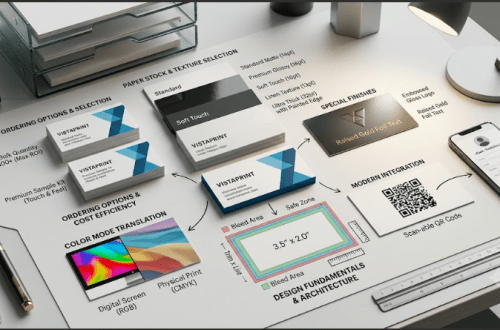
One of the most common mistakes beginners make is placing text too close to the edge of the card. When physical cards are printed and cut in bulk, there is a minor shifting of the paper (known as the “bleed”).
Bleed Area: Usually . Make sure your background color or pattern extends all the way to this edge so you don’t end up with awkward white borders.
Trim Line: The final cut size of your card ().
Safe Zone: Keep all important text and logos at least inside the trim line. If it’s outside the safe zone, it risks being sliced off during printing.
Step 2: Establish a Strict Typographic Hierarchy
Do not use more than two font families on your card.
The Primary Font (Your Name): Make this bold, readable, and reflective of your brand personality. (Size: 10pt to 14pt).
The Secondary Font (Your Details): Choose a highly legible sans-serif font (like Helvetica, Montserrat, or Open Sans). Do not go smaller than 7pt, or people will need a magnifying glass to read your email.
Step 3: Embrace “Negative Space”
White space (or negative space) is not empty space; it is a design element. It gives the recipient’s eyes room to breathe. If your card is crammed with text, social media icons, a laundry list of services, and three different phone numbers, it will look chaotic.
Pro-Tip: If you have too much information, utilize a QR code. Point the QR code to a Linktree, your LinkedIn profile, or a custom landing page. This keeps the card clean while offering an interactive bridge to your digital world.
Step 4: Choose the Right Paper Weight and Finish
The design on your screen is only 50% of the equation; the physical paper is the other 50%. When ordering your prints through your chosen business card maker, look at these specifications:
Paper Weight: Measured in “pt” or “gsm”. Do not go lower than 14pt (approx. 300gsm). If you want a truly premium feel, opt for 16pt to 18pt cardstock.
Matte Finish: Elegant, modern, non-reflective, and easy to write on. Great for modern, minimalist designs.
Glossy Finish: Vibrant, shiny, and makes photos or colorful logos pop. However, it can look a bit cheap if not executed well, and it attracts fingerprints.
Specialty Finishes: If your budget allows, consider spot UV (which adds a raised, glossy texture to specific parts of your design, like your logo) or gold foil stamping.
Common Mistakes to Avoid (The “Don’t Do This” List)
Before you hit “Order” on your business card maker, run your design through this quick checklist:
Using Low-Resolution Images: Your logo must be high-resolution (at least 300 DPI). If you upload a pixelated screenshot of your logo, it will look blurry and unprofessional in print.
Hard-to-Read Color Combos: Avoid white text on a light gray background, or yellow text on a white background. Contrast is key for legibility.
Overloading Social Media Icons: You do not need the Facebook, Instagram, X, TikTok, and Pinterest logos on your card. Pick the one platform where you are most active and professional, or simply use a single website URL.
Forgetting to Proofread: It sounds obvious, but double-check your spelling, phone numbers, and emails. Have a friend look at it too—our brains have a funny habit of autocorrecting our own typos.
4. Conclusion: Your Card, Your Brand
A business card is more than a tool for handing out contact information; it is a physical extension of your professional identity.
By leveraging a modern business card maker like Canva or Moo, you don’t need a degree in graphic design to create a memorable card. The secret lies in simplicity: choose a clean layout, prioritize typography, respect the print margins, and invest in a thick, high-quality paper stock.
With these design fundamentals in hand, you can confidently create a physical handshake that leaves a lasting, positive impression long after the initial meeting is over. Now, pick your platform, design with intention, and get ready to network like a pro!